Preface
The Galite Project is a framework that lets you build business applications with few code. It’s the successor of the Kopi project which is a framework from the company DMS that allows the development of database applications using Java, JDBC, SWING and Vaadin 7.
Galite allows creating database applications in a high level specification language using Kotlin DSL and Exposed.
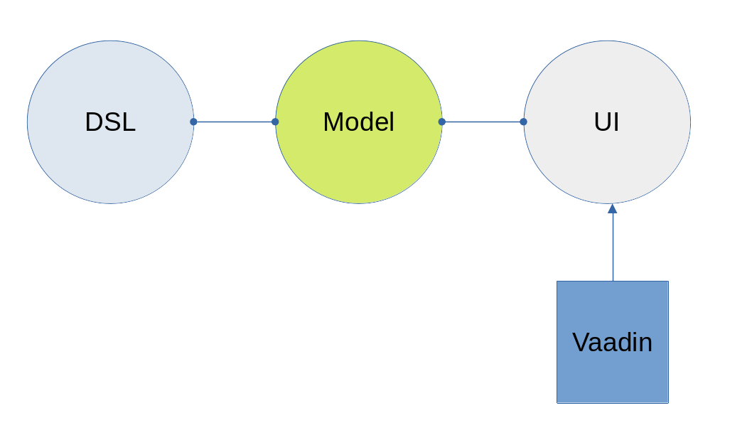
The basic architecture of Visual Galite package is made of a three strongly independent parts:
-
DSL: The DSL is the Kotlin functions provided for the user to develop an application.
-
Model: The model layer is a set of model classes responsible for structuring and processing data. Also, it contains a high specification interfaces that any UI implementation should respect.
-
UI: The UI is the presentation layer that represents the user interface. This can be extended to implement many technologies (web, mobile, desktop, etc.). For the moment Galite can generate a web application implemented in Vaadin flow (21+).
Organization of This Document
This documentation includes two main Chapters:
-
CHAPTER 1 : Getting Started
This chapter is intended to show how to configure the application and essential features to query the database.
-
CHAPTER 2 : The Visual Galite application Framework
In this chapter, we will explore the capabilities of this framework.
Getting Started
Entry point
Galite provides an entry point to the application that should be implemented to customize the application.
If you are creating a Vaadin application, you should implement the class VApplication and specify your application configurations by overriding the class properties:
@Route("")
class MyApp : VApplication(Registry(domain = "GALITE", parent = null)) {

  override val sologanImage get() = "galite-slogan.png"

  override val logoImage get() = "galite-logo.png"

  override val logoHref get() = "http://[mywebsite]"

  override val alternateLocale get() = Locale("de", "AT")

  override val supportedLocales get() = arrayOf(Locale.FRANCE, Locale("de", "AT"), Locale("ar", "TN"))

  companion object {
    init {
      ApplicationConfiguration.setConfiguration(ConfigurationManager)
    }
  }

  object ConfigurationManager : ApplicationConfiguration() {
    override val version get(): String = "1.0"
    override val applicationName get(): String = "MyApp"
    override val informationText get(): String = "info"
    override val logFile get(): String = "log.txt"
    override val debugMailRecipient get(): String = "mail@adress"
    override fun getSMTPServer(): String = "smtp.server"
    override val faxServer get(): String = "fax.server"
    override fun mailErrors(): Boolean = false
    override fun logErrors(): Boolean = true
    override fun debugMessageInTransaction(): Boolean = true

    // And many other configurations. See ApplicationConfiguration.kt
  }
}
The Route annotation allows you to define the navigation URL of your web application.
Galite standard tables
There is a list of standard database tables used by Galite inorder to manage application modules and users. you may create these tables in your first database migration.
The definition of these tables is in the file DBSchema.kt. You can use Exposed to create these tables using SchemaUtils.create(table).
This is the role of every table:
-
MODULE: This table contains the modules of our application.
| Column | Type | Description |
|---|---|---|
ID |
integer |
Table identifier |
UC |
integer |
Number of changes applied on the current row. |
TS |
integer |
Timestamp of last changes on the current row. |
KURZNAME |
varchar(25) |
The short name of this module. |
VATER |
integer |
The ID of the parent of this module, if our module is a form we put here the menu id of this form. |
QUELLE |
varchar(255) |
The source name of the module. |
PRIORITAET |
integer |
The priority of the module compared to another module. Example module with priority 10 is placed before the module of priority 20 in the same menu. |
OBJEKT |
varchar(255) |
The object name or the class name that contains the code of this module. |
SYMBOL |
integer |
The icon of this module. |
-
BENUTZERRECHTE: The table
User Rightsdisplays the modules that each user is allowed to use.
| Column | Type | Description |
|---|---|---|
ID |
integer |
Table identifier. |
TS |
integer |
Timestamp of last changes on the current row. |
BENUTZER |
integer |
The user id |
MODUL |
integer |
The module id. |
ZUGRIFF |
bool |
The access value. |
-
GRUPPENRECHTE: This table displays the modules that each group of users is allowed to use.
| Column | Type | Description |
|---|---|---|
ID |
integer |
Table identifier. |
TS |
integer |
Timestamp of last changes on the current row. |
GRUPPE |
integer |
The group id. |
MODUL |
integer |
The module id. |
ZUGRIFF |
bool |
The access value. |
-
GRUPPENZUGEHOERIGKEITEN: This table contains the groups that each user belongs to. Each user can belong to many groups.
| Column | Type | Description |
|---|---|---|
ID |
integer |
Table identifier. |
TS |
integer |
Timestamp of last changes on the current row. |
BENUTZER |
integer |
The user id. |
MODUL |
integer |
The module id. |
ZUGRIFF |
bool |
The access value. |
-
SYMBOLE: This table store the icons for each module.
| Column | Type | Description |
|---|---|---|
ID |
integer |
Table identifier. |
TS |
integer |
Timestamp of last changes on the current row. |
KURZNAME |
varchar(20) |
The short name of this icon. |
BEZEICHNUNG |
varchar(50) |
The description of this icon. |
OBJEKT |
varchar(50) |
This column present the icon of the module. |
-
FAVORITEN: This table contains favorite modules for each user.
| Column | Type | Description |
|---|---|---|
ID |
integer |
Table identifier. |
TS |
integer |
Timestamp of last changes on the current row. |
BENUTZER |
integer |
The user id. |
MODUL |
integer |
The module id. |
-
KOPI_USERS: This table contains information about the users who use this application
| Column | Type | Description |
|---|---|---|
ID |
integer |
Table identifier. |
UC |
integer |
Number of changes applied on the current row. |
TS |
integer |
Timestamp of last changes on the current row. |
KURZNAME |
varchar(10) |
The short name of the user. |
NAME |
varchar(50) |
The name of the user. |
ZEICHEN |
varchar(10) |
The type of the user. |
TELEFON |
varchar(20) |
The phone number of the user. |
varchar(40) |
The email of the user. |
|
AKTIV |
bool |
is this user active? |
ERSTELLTVON |
timestamp |
Creation date of this user. |
ERSTELLTAM |
integer |
Created by. |
GEAENDERTAM |
timestamp |
The date of the change for this user. |
ERSTELLTAM |
integer |
Changed by. |
-
GRUPPEN: This table contains the names of the groups
| Column | Type | Description |
|---|---|---|
ID |
integer |
Table identifier. |
TS |
integer |
Timestamp of last changes on the current row. |
KURZNAME |
varchar(10) |
The short name of the group. |
BEZEICHNUNG |
varchar(40) |
The short description of the group. |
-
DUMMY: This table is for database sequences
| Column | Type | Description |
|---|---|---|
dummy |
char(1) |
Table identifier. |
Transactions
Every SQL statements should be executed within transaction. This allows to re-execute statements interrupted by deadlock (after asking the user if he wants to) or abort a whole transaction if something is wrong (like if a Java exception is thrown). The syntax is:
transaction("an optional message") {
  ...
  ... // a list of Exposed queries
  ...
}
In a visual context, the optional message allows to inform the user that the transaction is being processed. For example: Showing a dialog containing a spinner with the message (For example: "Inserting the record…" or "Loading…", etc..).
The new Types
Galite introduces 2 types to the basic types available in the Kotlin language :
-
Month : Years months values.
-
Week : Years weeks values.
Galite application framework
The visual Galite Framework is an application framework using the Kotlin DSL in order to create database applications easily. In this chapter we will see how to create Galite powered forms, reports and charts.
Generalities
Predefined Field Types
Every form or report field in Galite have field type that can be one of the 11 ready to use predefined types :
- DECIMAL                       // used to insert decimal values
- IMAGE                         // used to insert images
- INT                           // used to insert integer values
- TEXT                          // used to insert text values
- STRING                        // used to insert string values
- DATETIME                      // used to insert a datetime value
- BOOL                          // used to insert a true or false value
- MONTH                         // used to insert years months value
- TIME                          // used to insert a hours:minutes time value
- TIMESTAMP                     // used to insert a timestamp value
- WEEK                          // used to insert years weeks  value
The STRING Field Type
A STRING is used to enter characters which can be either letters, numbers or both. The width has always to be given. Moreover, you can optionally indicate how many rows it will contain and how many will finally be displayed on the form. If these optional arguments are used, you have to indicate the carriage return method by specifying either the FIXED ON or the FIXED OFF option.
There are also three other options you can use in order to modify the String’s case :
-
Convert.NAME (Converts the first letter of each word to capital letter)
-
Convert.UPPER (Convert the whole text to capital letters)
-
Convert.LOWER (Converts the whole text to normal letters)
Syntax:
STRING(
    width: Int,
    height: Int,
    visibleHeight: Int,
    [FixOption: Fixed,]
    [StringFormat: Convert,]
    [styled: Boolean]
)

FixOption    : Fixed.ON
               Fixed.OFF

StringFormat : Convert.UPPER
               Convert.LOWER
               Convert.NAME

styled      :  true   // present rich text
               false  // present text area
Example
val name = visit(domain = STRING(40, 10, 4, Fixed.ON, Convert.UPPER), position = at(1, 1)) {
    label = "Description"
    help = "A description"
}

// For better readability it's recommended to specify the parameters names:
STRING(width = 40, height = 10, visibleHeight = 4, fixed = Fixed.ON, convert = Convert.UPPER)
In this example, the text inserted will contain up to 40 characters and up to 10 rows. However, only the first 4 rows will be displayed on the form. Moreover, All the letters in the text will be converted to capital letters.
The TEXT Field Type
A Text and a String are similar apart from the fact that in a text, two parameters have always to be given: namely the width and the height of the field whereas you only need to determine the width in a string.
For example, you can write STRING(40, 10, 4) or STRING(40) but you have to write TEXT(40, 10) or TEXT(40, 10, 4).
Syntax:
TEXT(width: Integer ,height: Integer ,visible: Integer, [FixOption])

[FixOption]   : FIXED.ON
                FIXED.OFF
Example
val informations = visit(domain = STRING(80, 50, 10, Fixed.ON, styled = true), position = at(3, 1)) {
    label = "Richtext"
    help = "A Richtext editor"
}
In this example, the text inserted will contain up to 80 characters and up to 50 rows. However, only the first 10 rows.
The field is a richtext editor beacause the option styled is set to true.
The IMAGE Field Type
This field type is used to insert an illustration or a picture. When introducing an IMAGE, you have to determine its width and height. These values have to be integers and are measured in pixel. In this case, the two attributes are compulsory. The field will look like a file chooser that lets you choose an image file to show in the field.
Syntax:
IMAGE(width: Int, height: Int)Example:
val image = visit(domain = IMAGE(width = 20, height = 10), position = at(1, 3)) {
    label = "image"
    help = "The product image"
}
In this field, the image will have a width of 20 pixel and a height of 10 pixel.
The DECIMAL Field Type
A DECIMAL is used to insert numbers, integers, decimal numbers. The maximal width has to be determined for all them. The maximal scale i.e the number of characters standing after the comma has also to be defined. Also the comma has to be counted as a character. You can also set the minimum and the maximum values for the DECIMAL field with the optional parameters minValue and maxValue.
Syntax:
DECIMAL(width: Int, scale: Int)OR
object CustomDecimal: Domain<Decimal>(width: Int, scale: Int) {
    min = Decimal.valueOf("1.9")
    max = Decimal.valueOf("5.9")
}
Example:
val price = visit(domain = DECIMAL(width = 10, scale = 5), position = at(1, 1)) {
    label = "price"
    help = "The price"
}
The INTEGER Field Type
Integer field type is INT is used to insert integers. Only the text width is to be defined. The minValue and maxValue options are also available for this type.
Syntax:
INT(width: Int)OR
object CustomInt: Domain<Int>(width: Int) {
    min = 1
    max = 130
}
Example
val count = visit(domain = INT(3), position = follow(name)) {
    label = "Cars"
    help = "The number of cars"
}
Code Field Types
In addition to the predefined field types already available in Galite, you can define more specific types like CODE type.
The CODE types
The code Filed can be defined with many types like Boolean, Int, Decimal, etc… These types enable you to have a list of item-value pairs, the items will be displayed in the field and the values will be assigned instead.
-
The boolean code domain
In a CODE BOOL or BOOLEAN you have to assign a Boolean value to the item you have entered. Boolean values are values like "True" or "False" and "Yes" or "No".
Syntax:
object "NameToUse" : CodeDomain<Boolean>() {
    init {
        CodeBooleanList
    }
}

CodeBooleanList : CodeBoolean  [CodeBooleanList]

CodeBoolean     : code : String "keyOf" value : Boolean
Example
object Situation: CodeDomain<Boolean>() {
  init {
    "married" keyOf true
    "single" keyOf false
  }
}-
The integer code domain
In a CODE INT, you assign to each String item you have entered a INT value.
Syntax:
object "NameToUse" : CodeDomain<Int>() {
    init {
        CodeIntegerList
    }
}

CodeIntegerList : CodeInteger  [CodeIntegerList]

CodeInteger     : code : String "keyOf" value : Int
Example
object Days: CodeDomain<Int>() {
  init {
    "Sunday" keyOf 1
    "Monday" keyOf 2
    "Tuesday" keyOf 3
    "Wednesday" keyOf 4
    "Thursday" keyOf 5
    "Friday" keyOf 6
    "Saturday" keyOf 7
  }
}-
The decimal code domain
In a CODE DECIMAL, each item you have entered will get a DECIMAL value, i.e integers, fixed point numbers and fraction numbers.
Syntax:
object "NameToUse" : CodeDomain<Decimal>() {
    init {
        CodeFixedList
    }
}

CodeFixedList : CodeFixed  [CodeFixedList]

CodeFixed     : code : String "keyOf" value : Decimal
Example
object Accounting: CodeDomain<Decimal>() {
  init {
    "piece" keyOf Decimal.valueOf("1.00")
    "per cent" keyOf Decimal.valueOf("0.01")
  }
}-
The string code domain
In a CODE STRING, each item you have entered will get a STRING value, this can be useful for shortcut of long strings for example.
Syntax:
object "NameToUse" : CodeDomain<String>() {
    init {
        CodeStringType
    }
}

CodeStringType : CodeString  [CodeStringType]

CodeString     : code : String "keyOf" value : String
Example
object Currency: CodeDomain<String>() {
  init {
    "tnd" keyOf "Tunisian Dinar"
    "usd" keyOf "US Dollar"
    "eur" keyOf "Euro"
  }
}
The SELECT command
As you had the possibility to call up a list or a table from the database, with the option LIST, you now can make Galite sort out information from a whole list or a table which the option SELECT and this, according to criteria you have to define. Let’s say you want to view the degrees which can be achieved in a certain year. For this, you have to use the SELECT command as you see in the following rows:
Syntax:
class "ListName" : ListDomain<String>(20) {
    override val table = TableName

    init {
       ListColumns
    }
}

ListColumns : ListColumn  [ListColumns]

ListColumn  : SimpleName "keyOf" TableName.columnName [hasWidth width: Int]
When the type of the data in our database is different of VarChar or Binary we need to use the keyword hasWidth to specify the width of the data displayed :
Example
class CurrentDegree(year: Int) : ListDomain<String>(20) {
    override val table = query(
        Degree.selectAll {
            Degree.year eq year
        }
    )

    init {
        "Symbol" keyOf Degree.Symbol
        "Description" keyOf Degree.Description
        "year" keyOf Degree.year hasWidth 5
    }
}
"Degree" is the database table to which we have to access in order to select the information. In this example, we have used Exposed syntax to declare the select query from the Degree table, then we have created a list that contains two columns Symbol and Description those columns receive data from the result of the query.
The function keyOf is used in order to enter the columns in which Galite has to make its research.
The fucntion hasWidth is used in order to specify the width of the data displayed.
As a result of your selection, you will then have a table with two columns which will contain the different sorts of degrees achievable in the year you have entered.
Visual Galite Forms
The aim of Galite is to enable you to create applications. An application is made up of forms. A form is a set of pages consisting of blocks. A block is nothing else than a table which is divided into columns (vertical) and rows (horizontal). A row is made up of fields, and each field contains a data value at the intersection of a row and a column that can be of different Types. By the end of this chapter, you will learn how to create a form, but before, you need to learn how to create a field and how to form blocks.
Creating Form Fields
In Galite, fields are containers in which you can define different types of data.
To define a field you can call one of the 4 functions mustFill(), visit(), skipped() or hidden(). You can pass the domain and the position of the field in the block as arguments.
Syntax
val fieldName = mustFill(FieldDomain, [FieldPosition]) {
    FieldBody
}

|

val fieldName = visit(FieldDomain, [FieldPosition]) {
    FieldBody
}

|

val fieldName = skipped(FieldDomain, [FieldPosition]) {
    FieldBody
}

|

val fieldName = hidden(FieldDomain, [FieldPosition]) {
    FieldBody
}

FieldBody         : [FieldLabel] [FieldHelp] [FieldAlignment]
                    [FieldDropList]     [FieldOptions]    [FieldColumns]
                    [FieldCommands] [FieldTriggers]
Field Access Modifiers
An access modifier determines the way the application user will have to handle each field in a form as well as the field accessibility. There are 4 sorts of access modifier:
Syntax:
AccessModifier:   mustFill()
                  |
                  visit()
                  |
                  skipped()
                  |
hidden()-
mustFill : As indicated, a MUSTFILL field has to be filled by the user.
-
visit : A VISIT field is a field which the user can fill if he wants to.
-
skipped : A SKIPPED field is a field which is displayed on the form but which the user can not overwrite. A field is skipped if the user needs to know the information written in it.
-
hidden : A HIDDEN field that is not displayed on the form as the information it provides is of no importance for the user, this kind of fields is usually used for database table join operations or for ID fields.
As the user moves from a field to another when filling the form, the current field is always colored in red.
Example
val password = mustFill(domain = STRING(20), position = at(2, 1)) {
  ...
}

val id = hidden(domain = INT(20)) {
  ...
}
Field Position
This entry defines the position of the field in the current block. HIDDEN fields does not have positions, and in multiple block (Defined in the Blocks creation Section of this document) you may use the NO DETAIL Block option to pass positioning fields. There are two possibilities to define the field position.
-
Absolute Position With the function
at()- You can define it according to one integer or more:
-
-
at(row)
-
at(row , column)
-
at(row, column..multifield)
-
Syntax:
FieldPosition : at(row: Int  [,column: Int])
                |
                at(rowRange: IntRange,  [,column: Int])
                |
                at(row: Int  [,columnRange: IntRange])
                |
                at(rowRange: IntRange,  [,columnRange: IntRange])
                |
                follow(otherField)
Example
val name = visit(domain = STRING(20), position = at(1, 1..4)) {
  ...
}
The first integer indicates the row number while the second defines the column.
In fact, Galite automatically divides up the window in rows and columns when setting up a form.
When defining the width of a column, thus,
it always adopts the width of the longest field. Since the form wide is not unlimited,
you can put a long field in two or more columns in order to spare place as it is the case in the example above.
-
Relative Position With follow
You can also make use of the following structure : follow(otherField)
Example
val age = visit(domain = INT(3), position = follow(name)) {
  ...
}
If you declare a field with the follow function, it means that this field will be placed directly next to the first field defined by the follow property (field "Name") on the same row. The two fields will then form one single column.
Field label
The field label is optional, you declare it with the label property inside the field body, the syntax is the following :
Syntax
FieldLabel : label = "NAME OF THE FIELD"If you don’t want your field to have a label, you can set the property label to empty.
Example
val secondName = visit(domain = STRING(20), position = at(1, 1)) {
    label = "The second Name"
    ...
}
Field Help Text
this property is used to insert an explanation text for the application user in order to help him filling in the form. This Help text will then be displayed when the user places the mouse on the field.
Syntax:
HelpText: help = "HELP TEXT"Example
val lesson = visit(domain = STRING(20), position = at(1, 1)) {
    label = "lesson"
    help =  "The lesson you would like to attend"
    ...
}
Field Types
The field type is a required entry, you may enter a predefined field type :
Example
val name = visit(domain = STRING(20), position = at(1, 1)) {
    ...
}

val age = visit(domain = INT(3), position = at(1, 2)) {
    ...
}
You can also use self defined field types that you have previously defined in the type definition section of your form.
Example
val day = mustFill(domain = Days, position = at(1, 1)) {
    label = "day"
    help = "The day"
}
In this example, Days is a type you should have defined previously using standard types, Code types and SELECT command …
Field Alignment
This property is used to define the localization of the field’s content inside the field. There are three types of alignment.
-
FieldAlignment.RIGHT the value is displayed at the right inside the field
-
FieldAlignment.LEFT the value is displayed at the left inside the field
-
FieldAlignment.CENTER the value is centered in the field
Example
val name = visit(domain = STRING(20), position = at(1, 1)) {
    label = "name"
    align = FieldAlignment.LEFT
}
Field Drop files
This command is used to make a field accept to drop files into it, meaning you can drag files and drop them in your field.
Syntax:
DroppableDefinition : "droppable" ExtensionList
ExtentionList       : extension : String [,ExtenstionList]
Example
val cv = visit(domain = STRING(20), position = at(4, 1)) {
    label = "Cv"
    help = "The user curriculum vitae"
    columns(u.cv)
    droppable("pdf")
    trigger(ACTION) {
      FileHandler.fileHandler!!.openFile(form.model.getDisplay()!!, object : FileHandler.FileFilter {
        override fun accept(pathname: File?): Boolean {
          return (pathname!!.isDirectory
                  || pathname.name.toLowerCase().endsWith(".pdf"))
        }

        override val description: String
          get() = "PDF"
      })
    }
}
In this example, you can drag pdf files and drop them in the field named "cv".
Field Options
In this part of the field definition, you can use one or more option from the 9 options available for fields in Galite, here is the a list of these field options defined under the class FieldOption and that you can use them by declaring the function options().
-
NOECHO : If this option is used, characters typed in the field will not be displayed and a star(*) will be displayed instead, this option is useful for password fields.
-
NOEDIT : This option makes it impossible to change the data of the field or to overwrite it.
-
SORTABLE : This option adds two opposed arrows icons(up and down) just before the field, clicking on the icon changes the way data are sorted in the field, you can click the icon three times to have ascending sort, descending sort and default sort,
-
TRANSIENT : This option make the field transient, meaning that the system can no trail it, if a transaction calls this field and then this transaction is aborted, the field will not be able to backup or roll-back to its original value, besides this option makes changes ignored for this field.
-
NO DELETE ON UPDATE : If the field is a lookup is a column of a lookup table, using this option prevent the system to clear the field when inserting new rows or updating rows.
-
NO DETAIL : If the block is in detailed, using this option on a field make it invisible in the detail.
-
NO CHART : If the block is multiple, using this option on a field exclude it from the chart.
-
QUERY UPPER : Whatever the string you input, this option will make Galite transform it to capital letters.
-
QUERY LOWER : the opposite of the previous option it transform strings to lower case.
Example
val password = mustFill(domain = STRING(20), position = at(2, 1)) {
    label = "password"
    help = "The user password"
    options(FieldOption.NOECHO)
}
Field Columns
The columns method option is used to establish a connection between a certain column in the database with the field.Once such connection established, the field will have a direct access to the database column allowing insertions, modification …+
You may enter this option in order to specify which table and which column the field refers.
The same field can refer to more than one column.
You can also use the key method option to specify a key column in the database or the nullable method option to specify an outer joint.+
Two more option are available with the columns function, the index and the priority options.
Syntax:
columns(ColumnList) {
    ColumnsBody
}

ColumnsBody  : [ColumnIndex] [ColumnPriority]

ColumnList   : Column  [, Column ]
Column       : ["KEY (QualifiedName)"] ["NULLABLE (QualifiedName)"]
Example
 val id = hidden(domain = INT(20)) {
    label = "id"
    help = "The user id"
    columns(u.id)
}|
Note
|
that a field can be connected to more than one table and column. In this case, the statement you will type will be: |
Example
val id = hidden(domain = INT(20)) {
    label = "id"
    help = "The user id"
    columns(I.NumInvoice, ID.Invoice)
}
In this example, I is the invoices table and ID is the invoice details table and they have an outer join connection throw columns NumInvoice and Invoice.
-
Indexes
This option is used to define a value in the database which is to remain unique so that it can not appear anymore in another field of the same column. you need to use the index method to declare an index in Galite.
Let’s sum up with the following syntax:
Syntax:
ColumnIndex : "val i = index(message : String)"If two or more fields are given the same index value, it means that two similar combinations of these field values will not be accepted.
For example, two different lessons cannot be given in the same room. In this case, the three fields, namely the fields "professor", "time" and "lesson" are to be attributed the same index. Thus, at least one of the three values needs to be changed so that the combination can be accepted by the machine.
Example
val i = index(message = "this should be unique")

val lesson = mustFill(domain = INT(11), position = at(1, 1)) {
    label = "Lesson"
    help = "The lesson you have to attend to"
    column(LEC.Lesson)  {
        index = i
    }
}

val lecturer = mustFill(domain = INT(11), position = at(2, 1)) {
    label = "Lecturer"
    column(LES.Lecturer)  {
        index = i
    }
}

val time = mustFill(domain = STRING(20), position = at(3, 1)) {
    label = "Time"
    help = "The lesson you have to attend to"
    column(LES.Time)  {
        index = i
    }
}
However, this example would implicate a professor can give two different lessons at the same time. In order to avoid such errors, you can attribute one field two or more indexes. So you can associate the two fields "professor" and "time" together. Thus, you will have:
Example
val lessonIndex = index("Lesson should be unique")
val timeIndex = index("Time should be unique")

mustFill(domain = LONG(20)) {
  label = "Lesson"
  help = "The lesson you have to attend to"
  column(LEC.Lesson) {
    index = lessonIndex
  }
}

visit(domain = LONG(10)) {
  label = "Lecturer"
  column(T.Lecturer) {
    index = lessonIndex + timeIndex
  }
}

mustFill(domain = STRING(20)) {
  label = "Time"
  column(LEC.Time) {
    index = timeIndex
  }
}
In this case, notice that the "Lecturer" field has been associated with two indexes: lessonIndex and timeIndex.
The index value is ascendant. When attributing an index value to a field combination, you shall always take the value nexting that you have taken the last.
-
Priority
Syntax:
ColumnPriority: "priority = Integer"This option is used in order to define the column order within a list when this list is displayed. A priority is always followed by an integer according to the structure given above. The column with the biggest priority value will appear on the extreme left side of the table and the one with the least value will be on the extreme right side.
We shall notice that negative values are also permitted in this option. However, the minus sign ("-") standing before the number does not have any influence over its value but simply indicates the way all the information will be sorted out within a column. Actually, the different fields are always sorted in the ascending way, i.e from A to Z in case of an alphabetical text and from 1 to x+1 for numbers. Now, if the integer is preceded by a minus, the column content will be sorted in the other way round.
Example
val i = index(message = "this should be unique")

val surname = mustFill(domain = STRING(20), position = at(1, 1)) {
    label = "Surname"
    column(User.Surname)  {
        priority = 3
    }
}
If columns "Surname", "Name" and "Date of Birth" are respectively given the priorities 3,4 and 1, "Name" will come first and will be followed by "Surname" and "Date of Birth". The same order applies with the values 3, -4 and 1, with the only difference that the names will be sorted out from Z to A.
Moreover, two columns with the same priority will be displayed according to the same order in which the user has listed them.
Field Commands
Once you have defined the columns , you may define the field commands.
Syntax:
command(item : Actor, [AccessMode]) {
  CommandBody
}

CommandBody     :   CommandAction

CommandAction   :   KotlinCode

AccessMode      : "arrayOf(" vararg ListOfModes.. ")" |  vararg ListOfModes..
Standard Field Command
The command can be a Galite predefined command or you can make new Actors and commands you can use in the field command definition.
Example:
command(item = clear, Mode.UPDATE, Mode.INSERT, Mode.QUERY) {
  ...
}

val clear = actor()
Field Command using Modes
All the previous command definition ways can be preceded by one mode or more. There are three sorts of mode which are to be sorted according to the following hierarchy:
-
QUERY to start an inquiry within the database
-
INSERT to create a new row in the database
-
UPDATE to enter new information within a row
Example
command(item = insertMode, Mode.UPDATE, Mode.QUERY) {
  ...
}
If you have entered a mode for the command, it means this command can only be invoked if the block is in the mode you have determined.
Field Access modifiers using Modes
This method type is used to change the access to the field using the block Mode. In fact the access is not changed directly but the higher access possible is set to the indicated access.
We have 12 method allow us to change the visibility of our field :
-
onQueryHidden() : in mode Query set field to Hidden access
-
onQuerySkipped() : in mode Query set field to Skipped access
-
onQueryVisit() : in mode Query set field to Visit access
-
onQueryMustFill() : in mode Query set field to MustFill access
-
onInsertHidden() : in mode Insert set field to Hidden access
-
onInsertSkipped() : in mode Insert set field to Skipped access
-
onInsertVisit() : in mode Insert set field to Visit access
-
onInsertMustFill() : in mode Insert set field to MustFill access
-
onUpdateHidden() : in mode Update set field to Hidden access
-
onUpdateSkipped() : in mode Update set field to Skipped access
-
onUpdateVisit() : in mode Update set field to Visit access
-
onUpdateMustFill() : in mode Update set field to MustFill access
Example
 val file = visit(domain = STRING(25), position = at(3, 1)) {
      label = "test"
      help = "The test"
      onQueryHidden()
      onInsertHidden()
}
In this example, we have determined that the field will be invisible
if the block is in the QUERY or the INSERT mode.
Field Triggers
Triggers are events that you can use to execute actions when they occur, there are field triggers, block triggers and form triggers that you can use following this syntax :
Syntax
Trigger      : "trigger (" EventList ")" TriggerAction

EventList    : Event [,EventList]

TrigerAction : {KOTLIN code}
Field Triggers are events that concern the fields behavior, here is a list of all Galite field triggers available :
-
PREFLD : is executed upon entry of field
-
POSTFLD : is executed upon exit of field
-
POSTCHG : is executed on field content change
-
PREVAL : is executed before validating any new entry
-
VALFLD : is executed after field change and validation
-
VALIDATE : this is the same trigger as VALFLD
-
DEFAULT : Defines the default value of the field to be set if the setDefault() method is called (this method is automatically called when the user choose the insert command)
-
FORMAT : Not defined actually
-
ACCESS : ACCESS is a special trigger that defines how a field can be accessed. This trigger must return one of these values ACS_SKIPPED, ACS_HIDDEN, ACS_VISIT or ACS_MUSTFILL.
-
VALUE : equates the value of two fields
-
AUTOLEAVE : must return a boolean value, if "true" the cursor will move to the next field
-
PREINS : is executed before inserting a row of the database
-
PREUPD : is executed before updating a row of the database
-
PREDEL : is executed before deleting a row of the database
-
POSTINS : is executed after inserting a row of the database
-
POSTUPD : is executed after updating a row of the database
Examples
val age = visit(domain = INT(3), position = follow(name)) {
    label = "age"

    trigger(POSTCHG) {
      name.value = "userName"
    }
  }
in the example above we will assign the value "userName" to the name field each time we change the value of the age field.
val password = mustFill(domain = STRING(20), position = at(2, 1)) {
    label = "password"

    trigger(ACCESS) {
      if (name.value == "hidden") {
        Access.HIDDEN
      } else {
        Access.SKIPPED
      }
    }
}
Creating Form Blocks
As you already know, a form is composed of blocks. A block is a set of data which are stocked in the database and shown on a form. A block is created in order to either view the content of a database, to insert new data in the database or to update existing data in the database. To create a block you need first to create a class that extend from Block class here we can specify the name, the buffer size and the rows number of the block as parameter, in second part you need to use insertBlock method that allow you to add the block to the form.
Syntax
class Block: Block(blockName : String, buffer: Int, rows: Int) {
    BlockBody
}

BlockBody       : [blockBoder] [blockAlignement] [blockHelp]
                  [blockOptions] [blockTables]
                  [blocIndices] [blockCommands] [blockTriggers] blockFields
                  [blockContextFooter]
Block Types
There are actually two types of blocks in Galite, the only difference between them in the definition syntax is the buffer Integer.
-
single blocks
A single block is a block in which only one single row of a database table is displayed on the form. Each time, the computer will memorize only one entire row and a certain quantity of ID numbers through which it will retrieve another rows from the database if you want to view them.
Example
class BlockCommand : Block("Commands", 1, 5) {
  ...
}

// usage:

val BlockCommand = page.insertBlock(BlockCommand()) {
...
}
The first integer indicates the block type. In case of a single block, the first integer will always be 1. The second integer indicates the maximal number of the automatically memorized IDs.
-
Multiple Blocks
A multiple block is a block in which more than one row are displayed on the form. These rows are retrieved all at once from the database and are memorized by the computer. Actually, you can define the number of the displayed rows which can be less than this of the memorized rows. In this case, there will be no need anymore to retrieve the hidden rows from the database when you want to view them.
Example
class BlockCommand : Block("Commands", 10, 5) {
  ...
}
The first integer indicates the number of rows to be automatically memorized while the second defines the number of displayed rows. Notice the first integer value must always be greater than 1.
Block Names
The example bellow show how to create a block, you need to specify the block title as parameter in the Block class.
Example
class Degree : Block("Degree Block", 10, 5)Block Border
You can insert the optional border statement that defines the Block’s frame type into the init block. Besides, the Title of the block will appear only if the Block’s Border type has been specified. There are actually four Border options defined into Border enumeration class :
-
Border.LINE to frame the block with lines.
-
Border.RAISED to enhance a block by setting it on the foreground.
-
Border.LOWERED to put it at the background.
-
Border.ETCHED to carve a frame in the form.
Example
inner class Degree : Block("Degree Block", 10, 5) {
    init {
        border = Border.LINE
    }
}
Block Alignment
Alignment statements are useful to align a block(source block) referring to another one(target block). Use the align method and you have to specify the referred block name followed by one or many pairs of two fields the pairs are separated by a comma. As for the pair fields, the one in the left is the source block field while the other one is for the target block field.
For Example, let us suppose we have a multiple block Prices with 4 columns, with column 3 filled with Quantities and Column 4 with Prices, we also have a single block TotalPriceswith two fields totalQuantity and totalPrices, we want these fields to be aligned with the correct fields of the Prices block, so we specify that the totalQuantity field is aligned with the field quantity of the block Prices, same thing for totalPrice field it’s aligned with the price field of the block Prices:
Example
val targetBlock = insertBlock(Prices())

val TotalPrices = block("Total", 1, 1) {

  val totalQuantity = visit(INT(3), position = at(1, 1)) {
    label = "Total"
    help = "Total"
  }
  val totalPrice = visit(INT(7), position = at(1, 2)) {}

  align(targetBlock, totalQuantity to targetBlock.quantity, totalPrice to targetBlock.price)
}
Block Help
This optional command is used to define the help text for each field of the block. You need to set the value of help property.
Example
inner class Degree : Block("Degree Block", 10, 5) {
    init {
          border = Border.LINE
          help = "test"
          ...
    }
}
Block Options
You need to use options function in your block to specify block options. you can find the list of available options in BlockOption class :
-
NOCHART : Disables the chart(grid) rendering of a multiple bloc to make it look like a single block.Only possible on multiple blocks displaying only one row, Besides the fields must be positioned with the AT command.
-
NODETAIL : Disables the positioning of fields and displays the block as a chart (grid), Only possible on multiple blocks, the fields should not be positioned with the AT command.
-
NODELETE : Prevent the user from removing fields content.
-
NOINSERT : Prevent the user from inserting data in fields.
-
NOMOVE : Prevent the user from moving between records.
-
ACCESS_ON_SKIPPED : Makes the block accessible even if or its fields have SKIPPED access.
-
UPDATE_INDEX : If used, saving a block would delete all its rows and reinsert them one by one, by doing so, you can update the table rows even when you change the index fields without worrying about the "row already exist exception".
inner class Degree : Block("Degree Block", 10, 5) {
    init {
          options(BlockOption.NODETAIL)
          ...
    }
}
Block Tables
When making use of this section, you have to type the function table and enter the table name, assign this function to an variable. This variable will further be used as a shorthand in place of the complete table name in order to access to the table. These names refer to certain tables in the database whereby the first table is the one on which the user will work. The remaining tables are the so-called "look-up tables", i.e tables that are associated with the first one.
Syntax:
BlockTables: table(vararg ExposedTables)Example
inner class School : Block("School", 1, 1) {
  val L = table(Lessons)
  val P = table(Lecturers)
  val R = table(Rooms)
  ...
}
The user will make use of these look-up tables as references when bringing in changes in the principal table.
Block Indexes
If you plan to enter one index or more when defining your fields, you also have to define one index text or more which will appear if you make a mistake by entering an indexed data or a data combination twice. This command can be followed by an error message contained in a string.
Syntax:
BlockIndices: "index(" message : String ")" [BlockIndices]*Example
inner class Degree : Block("Degree", 1, 1) {
  val unique = index(message = "This data already exists")
  ...
}
Block Commands
Block commands are commands accessible only from the block where they are called. There are Three ways to call block commands:
-
Calling A Standard Command
Structure of command:
"command (" SimpleItemName ")" {KOTLIN Code}Example
command(item = Validate) {
  validate ()
}-
Calling The Block Commands With Modes
Blocks have 3 possible Modes:
-
QUERY : When querying the database
-
INSERT : When inserting a new row in the database
-
UPDATE : When updating rows in the database
You can combine these modes with the previous block command structure to have more control over your command Use the mode function inside you command body declaration to set the modes :
Syntax
"command (" SimpleItemName, [Modes]")" {}

Modes: Mode*
This means that the command called is only accessible when the block is in the specified Mode.
Example
command(item = Validate, Mode.UPDATE, Mode.QUERY) {
  validate ()
}-
Calling The Block Commands With Modes And An Access Modifier
in Galite, a field can have different access types or modifiers, here is the definition of the four available access modifiers listed by ascending level.
-
HIDDEN : HIDDEN field are invisible in the form, they are used to store hidden operations and database joins.
-
SKIPPED : SKIPPED fields are read only fields, you can read the value but you can’t modify it.
-
VISIT : fields with this access type are accessible, can be modified but not necessary.
-
MUSTFILL : MUSTFILL fields are accessible fields that the user must fill with a value.
In the block command section, you can set the highest access level for the block fields according to the mode in wich the block would be ording to the mode in which the block would be.
Example
blockVisibility(Access.SKIPPED, Modes.QUERY, Modes.UPDATE)
blockVisibility(Access.HIDDEN, Modes.UPDATE)
blockVisibility(Access.VISIT, Modes.QUERY)
In the first example, all fields in the block will be either SKIPPED or HIDDEN in the query and update modes and can neither be MUSTFILL nor VISIT. For the second example, all the fields in the block will be HIDDEN when the block is in update mode. In the last example, all the fields in the block will be either VISIT, SKIPPED or HIDDEN in the query mode and can not be MUSTFILL.
Block Triggers
The block triggers are the same as form triggers on the block level. There are actually 20 block triggers you can use to execute actions once they are fired.
Syntax
 BlocTrigger: "trigger(" TriggerAction : BlocEventList ")"

 BlocEventList: BlockEvent [,BlockEvent]*
Concerning the trigger action, which is the action to execute when the trigger is activated they can by : ** {KOTLIN code}
Here is a list of all available block triggers or block events in Galite.
-
PREQRY : executed before querying the database
-
POSTQRY : executed after querying the database
-
PREDEL : executed before a row is deleted
-
POSTDEL : executed after a row is deleted
-
PREINS : executed before a row is inserted
-
POSTINS : executed after a row is inserted
-
PREUPD : executed before a row is updated
-
POSTUPD : executed after a row is updated
-
PRESAVE : executed before saving a row
-
PREREC : executed upon record entry
-
POSTREC : executed upon record exit
-
PREBLK : executed upon block entry
-
POSTBLK : executed upon block exit
-
VALBLK : executed upon block validation
-
VALREC : executed upon record validation
-
DEFAULT : is executed when the block is in the InsertMode. This trigger becomes active when the user presses the key F4. It will then enable the system to load standard values which will be proposed to the user if he wishes to enter new data.
-
INIT : executed upon block initialization
-
RESET : executed upon Reset command (ResetForm)
-
CHANGED : a special trigger that returns a boolean value of wether the block have been changed or not, you can use it to bypass the system control for changes this way :
 trigger(CHANGED) {
   return false;
 }
-
ACCESS : defines whether a block can or not be accessed, it must always return a boolean value
  trigger(ACCESS) {
    return Block.getMode() == MOD_QUERY
    // Tests if the block is in query mode,
    this block is only accessible on query mode
  }
Examples
object Degree : Block("Degree block", 10, 5) {

  trigger(PREBLK, INIT) {
   Kotlin-Code
  }

  trigger(PREINS) {
   println("Inserting date");
   ...
  }
  ...
}
Block Fields Declaration
In this section, all you have to do is to write at least on block field definition that begins with an access modifier and ends with brace "}", you can enter as much fields as you may need following the field definition we saw in the previous chapter.
Examples
val name = visit(domain = STRING(25), position = at(1, 2)) {
      label = "Last name"
      help = "The client name"
      columns(c.name)
}
Creating Forms
There are actually two types of forms in Galite, normal forms and BLOC INSERT forms which are special forms containing blocks that you may insert in other forms.
A form begins always with FORM and ends with END FORM, while a BLOC INSERT form begins with BLOC INSERT and ends with END INSERT.
In Galite to create a form you need to extend from this list off classes :
-
Form : Represents a form.
-
ReportSelectionForm : Represents a report selection form.
-
DictionaryForm : Represents a dictionary form.
When creating a form, you will have to include the block and the field definitions. Moreover, you will have to define the menus as well as the different commands. Finally, you can also define some form triggers. Concretely, the structure is the following:
Syntax:
FormDef :
          class FormSample: Form("title ="  formTitle : String, ["locale ="  formLocalization : String])
          {
              [MenuDefinition]
              [ActorDefinition] [TypeDefinition]
              [CommandDefinition] [InsertDefinition]

              [FormCommands] [FormsTriggers] [BlocksDefinition]
          }
Form Localization
This is an optional step in which you may define the language of your forms menus and messages, the latter have to be defined in xml files.
Syntax
"Form(title =" formTitle : String, "locale =" formLocalization : String")"Example:
class LecturersForm : Form(title = "Form", locale = Locale.UK) {}Form Title
Every form have can have a title (optional).
Syntax
"Form(title =" formTitle : String")"Example
class LecturersForm : Form(title = "Lecturers List", locale = Locale.UK) {}Menus Definition
Defining a menu means adding an entry to the menu bar in the top of the form, you can add actors to this menu later by specifying the menu name in the actor definition.
Syntax:
MenuDefinition: "menu (" label : String ")"Example
class ListLecturersForm : ReportSelectionForm(title = "List of the Lecturers", locale = Locale.UK) {
  val file = menu("file")
  ...
}
Actors Definition
An Actor is an item to be linked with a command, if its ICON is specified, it will appear in the icon_toolbar located under the menu bar, otherwise, it will only be accecible from the menu bar. ICON and KEY are optional, the KEY being the keyboard shortcut to assign to the actor.
Syntax:
ActorDefinition:  "actor"(
                    "menu" = SimpleName,
                    "label" = label : String,
                    "help" = helpText : String,
                  ) {
                    [key = key  : String]
                    [icon = icon : Icon]
                  }
Example
class ListLecturersForm : ReportSelectionForm(title = "List of the Lecturers", locale = Locale.UK) {
  val file = menu("file")
  val cut = actor(
    menu = file,
    label = "cut",
    help = "cut element",
  ) {
    key = Key.F2          // key is optional here
    icon = Icon.CUT       // icon is optional here
  }
  ....
}
Types Definition
After having defined your menus and actor, you can enter different field types definitions based on the standard field types or code field types, you can also use SELECT commands to customize these new types.
Example
class ListLecturersForm : ReportSelectionForm("") {

    object Days: CodeDomain<Int>() {
      init {
        "Sunday" keyOf 1
        "Monday" keyOf 2
        "Tuesday" keyOf 3
        "Wednesday" keyOf 4
        "Thursday" keyOf 5
        "Friday" keyOf 6
        "Saturday" keyOf 7
      }
    }

    object CurrentDegree : ListDomain<String>(20) {
      override val table = query(Degree.selectAll())

      init {
        "Symbol" keyOf Degree.Symbol
        "Description" keyOf Degree.Description
      }
    }
}
Commands Definition
In this section you may want to define new commands, to do so, all you need is an already defined Actor from which you will call the command in order to execute an Action on the form. every command have a effective ray of action (VField, VBlock, VForm)
-
Simply writing the body of the action using the ACTION command, the parameters are optional and can be VField, VBlock, VForm.
Command Defined in this section can be form level commands, block level commands or field level commands, this will depend on the action called by the command and where the command is actualy called.
Syntax
cmdDef  : "command (" SimpleItemName  ")" { commandBody }

commandBody: { KOTLIN statements }
Example Writing the action’s body :
command(item = PrintBlock) {
  blockName.validate()
  blockName.getForm().close(VForm.CDE-Validate)
}
After the different definitions we have made (types, menus, actors,commands), we need to begin the declaration of our form.Here, we will set up the structure and the behaviour of the form throw 4 sections :
-
Form Options
-
Form Commands
-
Form Triggers
-
Blocks
Form Commands Declaration
There still one more think to know about form command declaration, in fact, you can also control the accessibility to a command by the Mode of the form.+ A form have 3 possible Modes :
-
QUERY : When inquiring the database
-
INSERT : When inserting a row in the database
-
UPDATE : When updating a row in the database
The Syntax to use command with modes is the following :
Syntax
"command (" SimpleItemName, Modes  ")" {}

Modes: Mode*
This means that the command called is only accessible when the block is in the specified Mode.
Example
command(item = Validate, Mode.UPDATE, Mode.QUERY) {
  validate ()
}
Form Triggers Definition
Form Triggers are special events that once switched on you can execute a set of actions defined by the following syntax :
Syntax
FormTrigger  :  "trigger(" TriggerAction : FormEventList ")"
FormEventList:  FormEvent [,FormEvent]*
Galite actually defines 6 Form Triggers or Form Events :
-
INIT : executed when initializing the form and before the PREFORM Trigger, also executed at ResetForm command
-
PREFORM : executed before the form is displayed and after the INIT Trigger, not executed at ResetForm command
-
POSTFORM : executed when closing the form
-
QUITFORM : actually not available
-
RESET : executed upon ResetForm command
-
CHANGED : a special trigger that returns a boolean value of whether the form have been changed or not, you can use it to bypass the system control for changes this way :
val postform = trigger(POSTFORM) {
  println("post form trigger works")
}
Examples
val preform = trigger(INIT) {
    println("init form trigger works")
}

val initialisation = trigger(INIT, PREFORM) {
    //KOTLIN statements
}
Form Pages
You can create Pages in your form using the page function after the trigger declaration section,this is optional and will create a Tab for each page you create under the form’s toolbar. You can put as much blocks you want in each page, the same goes for form without pages.
Example
val p1 = page("Page1")
Visual Galite Reports
Visual Galite allows you to create dynamic reports. They have a very simple structure, in fact, all you have to do to create such reports is to list the definitions of all the fields you need, then you will that will load data into these fields in the init method by creating a query with Exposed syntax. The so created reports will have dynamic functions such as sorting and group making, you will also be able to print it or export to different file formats.You can even add other fields to the report after it’s generated, do more calculus, customize the report columns… The Galite Reports are generated from Visual Galite forms by different methods that we will see in this chapter, along with the process of making a dynamic report.
Creating Report Fields
As we said in the introduction, the report structure is based on report fields, these fields are declared based on field function and have the following syntax :
Syntax
ReportFieldDef: "field(" FieldType ")" {
                    [FieldLabel] [HelpText]  [FieldAlign] [FieldOptions]
                    [GroupCommand] [FieldCommands] [FieldTriggers]
                    }

GroupCommands : "group =" field
Example
val name = field(STRING(20)) {
  label = "name"
  help = "The user name"
  align = FieldAlignment.LEFT
  group = age
  format { value ->
    value.toUpperCase()
  }
}

val age = field(INT(3)) {
  label = "age"
  help = "The user age"
  align = FieldAlignment.LEFT
  compute {
    // Computes the average of ages
    Triggers.avgInteger(this)
  }
}
Report Field Label
The field label is the name that will be shown in the dynamic report, you can define a label by setting the label variable using String value.
Example
val name = field(STRING(20)) {
  label = "Person Name"
  ...
}

val age = field(INT(3)) {
    label = "age"
    ...
}

val ID = field(INT(3)) {
    label = ""
    ...
}
Report Field Help Text
Help variable is used to insert an explanation text for the application user. This Help text will then be displayed when the user places the mouse on the report field.
Example
val name = field(STRING(20)) {
  label = "Person Name"
  help = "The Person's First Name"
  ...
}
Report Field Type
The field type is a required entry, you may enter a predefined field type as parameter for the field function :
Example
val name = field(STRING(20)) {
  label = "Person Name"
  ...
}

val age = field(INT(3)) {
    label = "age"
    ...
}
You can also use self defined field types that you have previously defined in the type definition section of your report.
Example
val objectList = field(Objects) {
    label = "age"
    ...
}
In this example, Objects is a type you should have defined previously in type definition section of the report using standard types, CODE types and SELECT command …
Report Field Alignment
This command is used to define the localization of the field’s content inside the field. There are three types of alignment.
-
ALIGN RIGHT the value is displayed at the right inside the field
-
ALIGN LEFT the value is displayed at the left inside the field
-
ALIGN CENTER the value is centered in the field
Example
val Name = field(STRING(10)) {
    label = "name"
    align = FieldAlignment.CENTER
}
Report Field Options
There is actually only one option for the dynamic report fields in Galite: the HIDDEN OPTION , if this option is used on a field, he will not be visible the the report. This options have to be used on the last visible field of the report to avoid rendering bugs.
Example
val Name = field(STRING(10)) {
    label = "name"
    hidden
}
The field Name will not be visible on the report.
Report Field Group
You can create clickable groups in your report by using the keyword GROUP in you field followed by the field you want to be grouped by the actual field.
Example
val Customers = field(STRING(5)) {
    label = "Customers"
}

val Articles = field(STRING(10)) {
    label = "Articles"
}

val Articles = field(STRING(10)) {
    label = "Articles"
}

val Articles = field(STRING(10)) {
    label = "Articles"
}

val InvoiceNum = field(STRING(10)) {
    label = "InvoiceNum"
    group = Articles
    group = Customers
}
In this report, you can click on the InvoiceNum field to group customers and articles.
Report Field Command
In report Fields, you can call commands with this syntaxe :
"command (" SimpleItemName ")" {KOTLIN Code}Report Field Triggers
Report field triggers are special events that you can catch to execute other actions. In the field body call compute or format function and inside this function specify your code.
Syntax
Trigger      : TrigerAction : EventList

EventList    : Event [,EventList]*

TrigerAction : compute | format { KOTLIN code }
Here is the two triggers available for report fields :
-
FORMAT : applay style on the field content example change it to uppercase.
-
COMPUTE : executed when the report is displayed and can be used to compute expressions on the report columns and show the result.
Example
val salary = field(DECIMAL(width = 10, scale = 5)) {
  label = "salary"
  help = "The user salary"
  align = FieldAlignment.LEFT
  compute {
    // Computes the average of ages
    Triggers.avgDecimal(this)
  }
}

val name = field(STRING(20)) {
  label = "name"
  help = "The user name"
  align = FieldAlignment.LEFT
  group = age
  format { value ->
    value.toUpperCase()
  }
}
Creating Reports
Visual Galite Dynamic reports have a unique structure, you need to create new class that extend from Report class as described by the following syntax :
Syntax
ReportDefinition  :
class ReportClass : Report(ReportTitle, [ReportHelp], [ReportLocalization]) {
    [ContextHeader] [ReportDefinitions]
    [ReportCommands] [ReportTriggers] (ReportFields)
    [ContextFooter]
}

ReportTitle       : "title =" Title : String

ReportDefinitions : [MenuDefinition] [ActorDefinition] [TypeDefinition]
                    [CommandDefinition]
                    [InsertDefinition]
Report Localization
This is an optional step in which you may define the language of your forms menus and messages, the latter have to be defined in xml files.
Example:
Report(title : String, help: String, locale : Locale)Report Title
To set you report title you need to override the title variable of Report class.
Example
class ClientR : Report(title = "Clients_Report", locale = Locale.UK) {
    ...
}
Report Help Text
You can enter a help text for the report using the following syntax:
Syntax
Report(title : String, help : String, locale : Locale)Actually every report has a help menu that tries to describe the structure of the report by giving information about its commands and fields in a document, the help text will be on the top of this help menu document.
Example
class OrdersReport : Report(title = "Orders Report", help = "This report lists purchase orders", locale = Locale.UK) {}Report Menus Definition
Defining a menu means adding an entry to the menu bar in the top of the report, you can add actors to this menu later by specifying the menu name in the actor definition.
Syntax:
MenuDefinition: val SimpleName = "menu (" label : String ")"Example
class ListLecturersR : Report(title = "List of the Lecturers", locale = Locale.UK) {
  val newMenu = menu("newMenu")
}
Report Actors Definition
An Actor is an item to be linked with a command, if its ICON is specified, it will appear in the icon_toolbar located under the menu bar, otherwise, it will only be accessible from the menu bar. ICON and KEY are optional, the KEY being the keyboard shortcut to assign to the actor.
Syntax:
ActorDefinition:
actor("menu =" SimpleName,
      "label =" label : String,
      "help" = helpText : String
     ) {
      [key = key  : String]
      [icon = icon : Icon]
}
Example
class ListLecturersR : Report(title = "List of the Lecturers", help = "Clients_Report", locale = Locale.UK) {
 val newMenu = menu("newMenu")

  val printReport = actor(
          menu = newMenu,
          label = "Print",
          help = "Print the report",
  ) {
    key = Key.F9         // key is optional here
    icon = ICON.PRINT    // icon is optional here
  }
  ...
}
Report Types Definition
After having defined your menus and actor, you can enter different field types definitions based on the standard field types or code field types, you can also use the LIST and SELECT commands to customize these new types.
Syntax:
TypeDefinition: "object" SimplName":" CodeDomain<FieldType>() {[TypeList] } | "object" SimplName":" ListDomain<FieldType>() {[TypeList] }
Example
class LisLecturersR : Report("") {

    object Days: CodeDomain<Int>() {
      init {
        "Sunday" keyOf 1
        "Monday" keyOf 2
        "Tuesday" keyOf 3
        "Wednesday" keyOf 4
        "Thursday" keyOf 5
        "Friday" keyOf 6
        "Saturday" keyOf 7
      }
    }

    object CurrentDegree : ListDomain<String>(20) {
      override val table = query(Degree.selectAll())

      init {
        "Symbol" keyOf Degree.Symbol
        "Description" keyOf Degree.Description
      }
    }
}
Report Commands Definition
In this section you may want to define new commands, to do so, all you need is an already defined Actor from which you will call the command in order to execute an Action on the form. every command have an effective ray of action (VRField, VReport)
-
Simply writing the body of the action using the ACTION command, the parameters are optional and can be VRField or VReport.
Syntax
cmdDef  : "command (" SimpleItemName  ")" { commandBody }

commandBody: { KOTLIN statements }
Example Writing the action’s body :
val PrintReport = command(item = PrintReport) {
  action = {
    // KOTLIN code
  }
}
Report Triggers Declaration
Report Triggers are special events that once switched on you can execute a set of actions defined by the following syntax :
Syntax
ReportTrigger  :  "trigger(" TriggerAction : ReportEventList ")"
ReportEventList:  ReportEvent [,FormEvent]*
Galite actually defines 2 report Triggers or report Events :
-
PREREPORT : executed before the report is displayed.
-
POSTREPORT : executed after the report is closed.
Example
class SimpleReport : Report(title = "SimpleReport", locale = Locale.UK) {
  val preReport = trigger(PREREPORT) {
    println("---------PREREPORT TRIGGER-------------")
  }

  val postReport = trigger(POSTREPORT) {
    println("---------POSTREPORT TRIGGER-------------")
  }
  ...
}
Report Fields Declaration
As you already know, a dynamic report is based on field that will be shown as report columns, in this section you have to write at least on field definition or more following the definition and the structure we saw in the previous chapter.
Report data initialization:
You can define the report initial data in the constructor of your report class. You can use Exposed Syntax to create query that select data from you database tables, then you need to iterate this query and use the add statement to add the row to the report this function affect you data to the fields
For example here is a dynamic report named UserList with 3 fields (FirstName, LastName, Age), we will retrieve data from the User table on the database. Then affect the query result to our report to create rows.
Example
class UserList : Report("") {
  init {
    transaction {
      User.selectAll().forEach { result ->
        add {
          this[firstName] = result[Client.firstNameClt]
          this[lastName] = result[Client.lastNameClt]
          this[age] = result[Client.age]
        }
      }
    }
  }
}
Calling reports
A report is always called from a form, if the caller form extends from the DictionaryForm class you have to do the following steps :
-
Change DictionaryForm to ReportSelectionForm
-
Add a command that calls the
createReportmethod and pass the report as a parameter to this method.
Example
command(item = report) {
  createReport(ClientR())
}
Otherwise you can create a normal form or block command that executes the following code :
WindowController.windowController.doNotModal(UserList())Visual Galite Charts
Visual Galite allows you to create charts. They have a very simple structure, in fact, all you have to do to create such charts is to define the dimensions you need and their measures, then you will have to load data into these fields in the init section. With Galite Charts, you will also be able to print or export the created chart to different file formats.
The Visual Galite Charts are generated from Visual Galite form by different methods that we will see in this chapter, along with the process of making a visual charts.
Creating Charts dimensions and measures
As we said in the introduction, the chart structure is based on chart dimensions and measures. To create a dimension field you need to use dimension function and specify the type of the field, the field have the following syntax :
Syntax
ChartDimensionDef: "dimension(" DimensionType ")" {[DimensionLabel] [HelpText] DimensionType [DimensionCommands] [DimensionTriggers] }Example
val city = dimension(STRING(10)) {
  label = "dimension"

  format {
    object : VColumnFormat() {
      override fun format(value: Any?): String {
        return (value as String).toUpperCase()
      }
    }
  }
}
Use the measure function to create a measure field, this field have the following syntax :
Syntax
ChartDimensionDef: "measure(" DimensionType ")" {[DimensionLabel] [HelpText] DimensionType [DimensionCommands] [DimensionTriggers] }Chart "dimension / measure" Label
The label is the name that will be shown in the chart, you can define a label by setting the label value.
Example
val Name = dimension(STRING(10)) {
    label = "Person Name"
    ...
}

val ID = dimension(STRING(10)) {
    label = ""
    ...
}
Chart "dimension / measure" Help Text
Help variable is used to insert an explanation text for the application user . This Help text will then be displayed when the user places the mouse on the chart measure or dimension.
Example
val Name = dimension(STRING(10)) {
    label = "Person Name"
    help = "The Person's First Name"
}
Chart dimension Type
The dimension type is a required entry, you may enter a predefined dimension type :
Example
val Name = dimension(STRING(10)) {
    label = "Person Name"
    help = "The Person's First Name"
}

val Month = dimension(MONTH) {
    label = "Month"
}
You can also use self defined field types that you have previously defined in the type definition section of your chart.
Example
val objectList = dimension(Objects) {
    label = "objects"
}
In this example, Objects is a type you should have defined previously in type definition section of the chart using standard types, CODE types nd SELECT command …
Chart measure Type
The dimension type is a required entry but it is restricted to number types. This means that for a measure you can use only INT and DECIMAL as types. The measure type is checked at the compilation step. If you use not a numeric type for a measure, the following compiler error will be revealed :
Measure "Measure name" is not numeric.
The measure type can be defined with different ways :
Example
val Name = measure(INT(5)) {
    label = "Name"
}

val Name = measure(Price) {
    label = "Name"
}
In the last example, the price type should be a numeric type otherwise it would not be accepted.
Chart "dimension / measure" Command
In chart dimensions or measures, you can call commands with one of the following syntaxes :
"command (" SimpleItemName ")" { action = " {KOTLIN Code} }Chart "dimension / measure" Triggers
Chart dimensions or measures triggers are special events that you can catch to execute other actions.
Syntax
Trigger      : TrigerAction : EventList

EventList    : Event [,EventList]*

TrigerAction : color | format { KOTLIN code }
Here is the two triggers available for chart fields (dimensions & measures) :
-
FORMAT : Called for formatting a dimension value. The trigger should return a org.kopi.galite.visual.chart.VColumnFormat instance. This trigger is not available for measures.
-
COLOR : Called to specify a measure color. The trigger should return a org.kopi.galite.visual.visual.VColor instance. This trigger is not available for dimensions.
Example
val city = dimension(STRING(10)) {
  label = "dimension"
  help = "test"

  format {
    object : VColumnFormat() {
      override fun format(value: Any?): String {
        return (value as String).toUpperCase()
      }
    }
  }
}
Creating Charts
Visual Galite charts have a unique structure, you need to create new class that extend from Chart class as described by the following syntax :
Syntax
ChartDefinition   :
classChartClass : Chart(ChartTitle, [CharttLocalization]) {
    [ContextHeader] [CharttHelp] [ChartDefinitions]
    [ChartCommands] [ChartTriggers] (ChartFields)
    [ContextFooter]
}

ChartTitle        : "title =" Title : String

ChartDefinitions  : [MenuDefinition] [ActorDefinition] [TypeDefinition]
                    [CommandDefinition]
                    [InsertDefinition]
Chart Localization
This is an optional step in which you may define the language of your forms menus and messages, the latter have to be defined in xml files.
Example:
class ChartSample: Chart(title = "", locale = Locale.UK)Chart Title
To set you chart title you need to override the title variable of Chart class.
Example
class ChartSample: Chart(title = "Area/population per city", locale = Locale.UK) {
  ...
}
Chart Help Text
You can enter a help text for the chart using the following syntax:
Syntax
class ChartSample: Chart(title = titleText :String, help = helpText :String, locale = Locale.UK)Actually every chart has a help menu that tries to describe the structure of the chart by giving information about its commands and fields in a document, the help text will be on the top of this help menu document.
Example
class OrderedChart: Chart(
  title = "Ordered quantities per month",
  help = "TThis chart lists the ordered quantities per month",
  locale = Locale.UK
) {
  ...
}
Chart Menus Definition
Defining a menu means adding an entry to the menu bar in the top of the chart, you can add actors to this menu later by specifying the menu name in the actor definition. In the menu definition, the LABEL is optional.
Syntax:
MenuDefinition: val SimpleName = "menu (" label : String ")"Example
class OrderedChart: Chart(title = "Ordered quantities per month", locale = Locale.UK) {
  val newMenu = menu("newMenu")
  ...
}
Chart Actors Definition
An Actor is an item to be linked with a command, if its ICON is specified, it will appear in the icon_toolbar located under the menu bar, otherwise, it will only be accessible from the menu bar. ICON,LABEL and KEY are optional, the KEY being the keyboard shortcut to assign to the actor.
Syntax:
ActorDefinition:  "actor("
                         "menu =" SimpleName,
                         "label =" label : String,
                         "help" = helpText : String,
                       ) {
                         [key = key  : String]
                         [icon = icon : Icon]
                       }
Example
class OrderedChart: Chart(title = "Ordered quantities per month", locale = Locale.UK) {

  val newMenu = menu("newMenu")

   val printChart = actor(
            menu = newMenu,
            label = "Print",
            help = "Print the chart",
    ) {
      key = Key.F9         // key is optional here
      icon = Icon.Print    // icon is optional here
    }
    ...
}
Chart Types Definition
After having defined your menus and actor, you can enter different field types definitions based on the standard field types or code field types, you can also use the LIST and SELECT commands to customize these new types.
Syntax:
TypeDefinition: "object" SimplName":" CodeDomain<FieldType>() {[TypeList] } | "object" SimplName":" ListDomain<FieldType>() {[TypeList] }
Example
class OrderedChart : Chart("") {

  object Days: CodeDomain<Int>() {
    init {
      "Sunday" keyOf 1
      "Monday" keyOf 2
      "Tuesday" keyOf 3
      "Wednesday" keyOf 4
      "Thursday" keyOf 5
      "Friday" keyOf 6
      "Saturday" keyOf 7
    }
  }

  object CurrentDegree : ListDomain<String>(20) {
    override val table = query(Degree.selectAll())

    init {
      "Symbol" keyOf Degree.Symbol
      "Description" keyOf Degree.Description
    }
  }
}
Chart Commands Definition
In this section you may want to define new commands, to do so, all you need is an already defined Actor from which you will call the command in order to execute an Action on the chart. every command have an effective ray of action (VDimension | VMeasure, VChart)
-
Simply writing the body of the action using the ACTION command, the parameters are optional and can be VColumn or VChart.
Syntax
cmdDef: "command (" SimpleItemName  ")" { commandBody }

cmdBody: { KOTLIN statements }
Example
Calling a local action :
val print = command(item = printActor) {
  // KOTLIN code
}
Chart Triggers Declaration
Chart Triggers are special events that once switched on you can execute a set of actions defined by the following syntax :
Syntax
ChartTrigger  :    TriggerAction : ChartEventList
ChartEventList:    ChartEvent*
Galite actually defines 4 chart Triggers or chart Events :
-
PRECHART : executed before the chart is displayed.
-
INIT : executed at chart initialization.
-
CHARTTYPE : executed after the chart initialization. This trigger should return org.kopi.galite.visual.chart.VChartType and will a fixed type for the chart.
-
POSTCHART : executed after the chart is closed.
Example
class OrderedChart: Chart(title = "Ordered quantities per month", locale = Locale.UK) {
  val init = trigger(INITCHART) {
    chartType = VChartType.BAR
  }

  // This is the type that will be taken because CHARTTYPE is executed after INIT
  val type = trigger(CHARTTYPE) {
    VChartType.BAR
  }
}
Chart Fields Declaration
As you already know, a chart is based on field that will be shown as chart series, in this section you have to write at least on dimension and one measure definition or more following the definition and the structure we saw in the previous chapter.
Chart data initialization:
You can fill the chart’s lines or rows in the constructor of you chart class.
All you need to do is importing your data (from a variable, file, database query using Exposed…) , declaring a row in the chart then add the add() function to add the row to the chart.
For example here we have added three dimension and for each dimension we have to specify 2 measures
Example
init {
  city.add("Tunis") {
    this[area] = Decimal("34600")
    this[population] = 1056247
  }

  city.add("Kasserine") {
    this[area] = Decimal("806600")
    this[population] = 439243
  }

  city.add("Bizerte") {
    this[area] = Decimal("568219")
    this[population] = 368500
  }
}
Chart types
Galite offers five predefined chart types :
-
Pie charts
-
Bar charts
-
Column charts
-
Line charts
-
Area charts
The chart type can be defined by calling the setType(VChartType) method. The VChartType class contains the five definitions described above :
-
VChartType.PIE
-
VChartType.BAR
-
VChartType.COLUMN
-
VChartType.LINE
-
VChartType.AREA
If no type is defined, the chart type will be set to the default type which is the VChartType.DEFAULT = VChartType.COLUMN. The chart type can be set at INIT trigger or can be fixed using the CHARTTYPE trigger.
If you want to define a new type, you need to subclass the VChartType object and define the data series by overriding the createDataSeries(VChart). The view implementations should also be provided by implementing the UChartType component. The new chart type should be mentioned in the ChartTypeFactory class which is responsible for creating views for every chart type.
You should note that calling setType will create the data series and refresh the chart view. So it can be called whenever you want to change the chart type.
Calling charts
A chart is always called from a form. You have to do the following steps :
-
Add a command that calls the
createReportmethod and pass the report as a parameter to this method.
Example
command(item = graph) {
  showChart(ChartSample())
}
Otherwise you can create a normal form or block command that executes the following code :
WindowController.windowController.doNotModal(ChartSample())The Galite Project Future
After reading this document, you should be able to create efficient database applications using the Galite framework, you can also create dynamic reports and charts. Actually, the project owners are working on a web version of the Galite framework. This version features many capabilities and is based on the Vaadin framework which is an open source web application framework for rich Internet applications Vaadin, uses java as programming language to create web content and web components to render the resulting web page.